Satriadi, K. A., Ens, B., Czauderna, T., Cordeil, M., & Jenny, B. (2021, May). Quantitative data visualisation on virtual globes. In Proceedings of the 2021 CHI Conference on Human Factors in Computing Systems (pp. 1-14).

Kadek Ananta Satriadi
Human-centred computing researcher specialised in visualisation and spatial computing technologies.
Quantitative Data Visualisation on Virtual Globes
Kadek Ananta Satriadi, Barrett Ens, Tobias Czauderna, Maxime Cordeil, Bernhard Jenny
CHI Conference on Human Factors in Computing Systems. Yokohama, Japan (Virtual). 2021. Publication type: full paper.
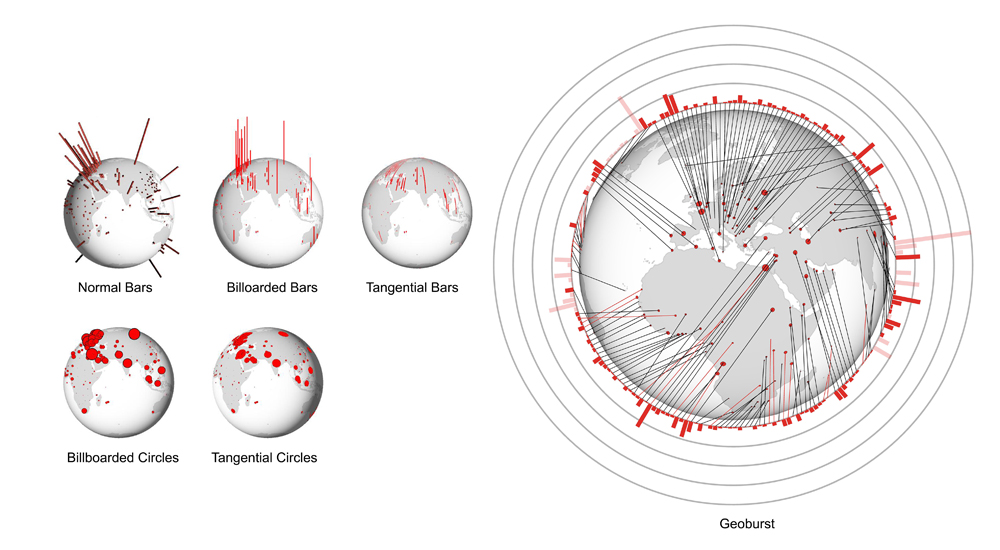
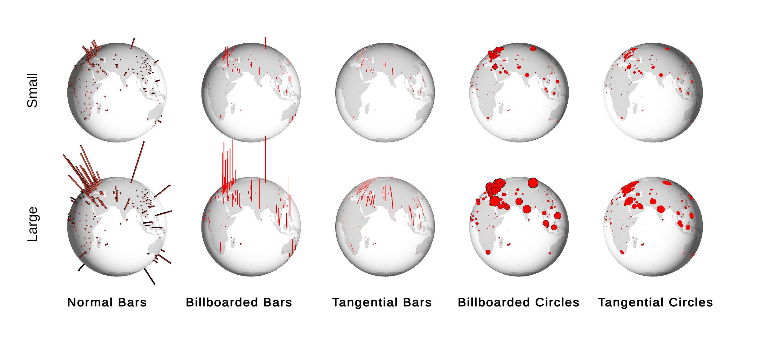
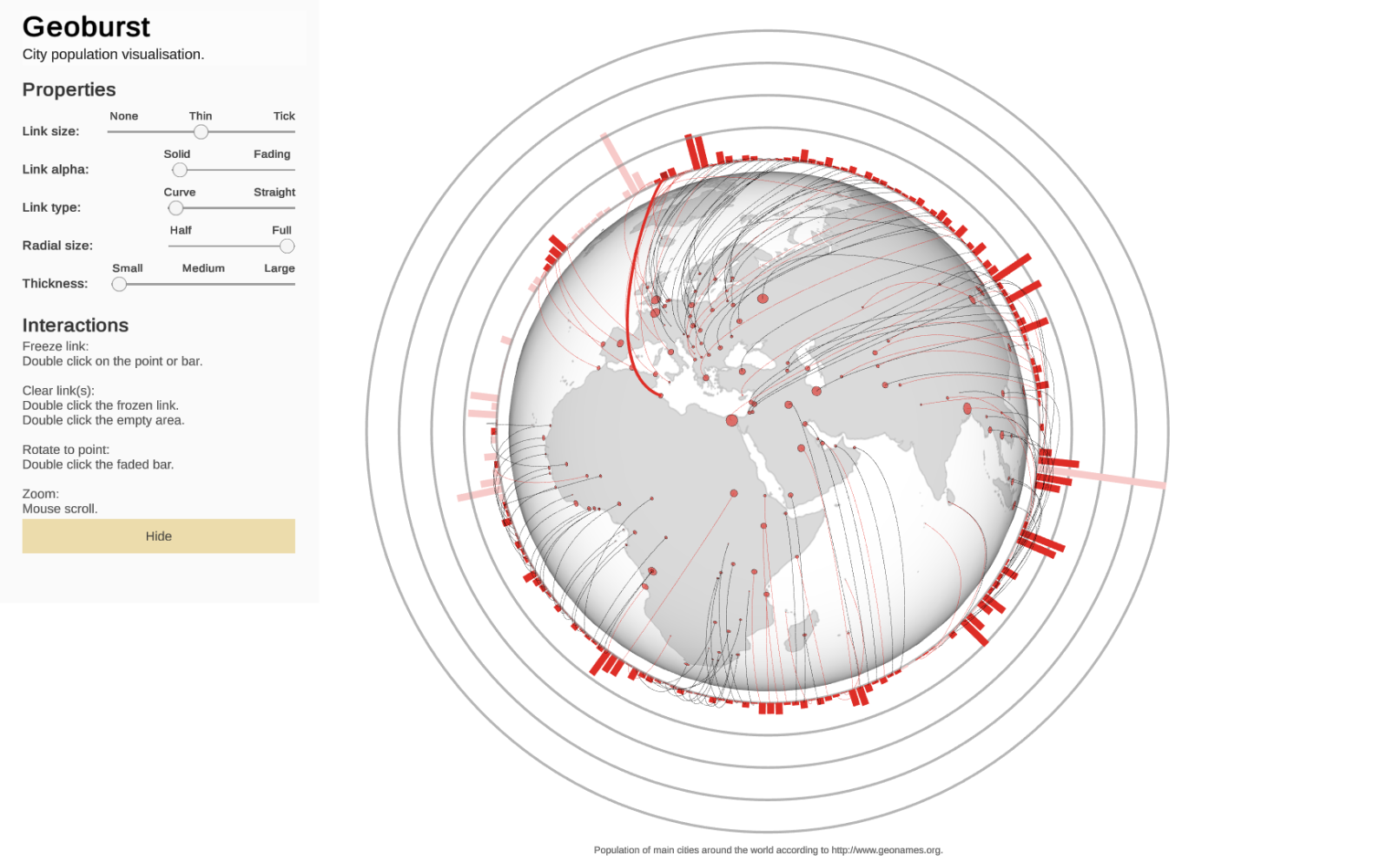
Geographic data visualisation on virtual globes is intuitive and widespread, but has not been thoroughly investigated. We explore two main design factors for quantitative data visualisation on virtual globes: i) commonly used primitives (2D bar, 3D bar, circle) and ii) the orientation of these primitives (tangential, normal, billboarded). We evaluate five distinctive visualisation idioms in a user study with 50 participants. The results show that aligning primitives tangentially on the globe’s surface decreases the accuracy of area-proportional circle visualisations, while the orientation does not have a significant effect on the accuracy of length-proportional bar visualisations. We also find that tangential primitives induce higher perceived mental load than other orientations. Guided by these results we design a novel globe visualisation idiom, Geoburst, that combines a virtual globe and a radial bar chart. A preliminary evaluation reports potential benefits and drawbacks of the Geoburst visualisation.
DOI: https://dl.acm.org/doi/10.1145/3411764.3445152
Preprint: download
Presentation: watch
Slides: download
Tags: chi,globe,perception,virtual globe
This work is featured in Thematic Cartography and Geovisualization, Fourth Edition textbook published in August 2022 by Slocum et al.
The following image shows five globe visualisation idioms in large and small maximum range.
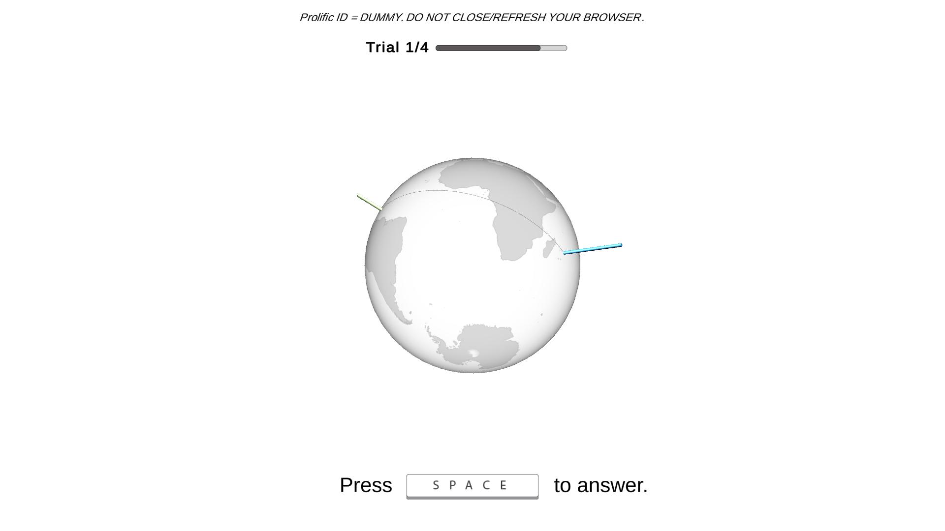
We gathered data from crowdsourcing and non-crowdsourcing participants using an online experiment that we hosted on our web server. The task of the experiment is well-known relative size comparison task, where participants were asked to compare relative value of a pair of visual primitives.
We then designed a new globe visualisation design, Geoburst. Geoburst uses the composite visualisation approach by wrapping the globe visualisation with a radial bar chart. This design choice is expected to improve reading accuracy of the values.
Related Publications
-
Tangible Globes for Data Visualisation in Augmented Reality
Kadek Ananta Satriadi, Jim Smiley, Barrett Ens, Maxime Cordeil, Tobias Czauderna, Benjamin Lee, Ying Yang, Tim Dwyer, Bernhard Jenny -
HandovAR: Towards AR and AI Support for ICU Nurse Handover
Mengxing Li, Phoebe Zhang, Jiazhou Liu, Agnes Haryanto, Kadek Ananta Satriadi, Trung Nguyen, Deval Mehta, Zerina Lokmic-Tomkins, and Tim Dwyer -
MarioChart: Autonomous Tangibles as Active Proxy Interfaces for Embodied Casual Data Exploration
Shaozhang Dai, Kadek Ananta Satriadi, Jim Smiley, Barrett Ens, Lonni Besançon, Tim Dwyer -
When Temples Travel: Towards Understanding Cultural Impacts of Visualizing Sacred Sites in Foreign Contexts
I. G. M. Darmawiguna, Kadek Ananta Satriadi, Thomas Chandler, Bernhard Jenny, Made Windu Antara Kesiman, Putu Hendra Suputra, and Kadek Teguh Dermawan -
Strollytelling: Coupling Animation with Physical Locomotion to Explore Immersive Data Stories
Radhika Pankaj Jain, Adam Drogemuller, Kadek Ananta Satriadi, Ross Smith, Andrew Cunningham -
That's Rough! Encoding Data into Roughness for Physicalization
Xiaojiao Du, Kadek Ananta Satriadi, Adam Drogemuller, Brandon Matthews, Ross T. Smith, James Walsh, Andrew Cunningham -
Active Proxy Dashboard: Binding Physical Referents and Abstract Data Representations in Situated Visualization through Tangible Interaction
Kadek Ananta Satriadi, Barrett Ens, Sarah Goodwin, Tim Dwyer -
Defining Embodied Provenance for Immersive Sensemaking
Yidan Zhang, Barrett Ens, Kadek Ananta Satriadi, Ying Yang, Sarah Goodwin -
ProxSituated Visualization: An Extended Model of Situated Visualization using Proxies for Physical Referents
Kadek Ananta Satriadi, Andrew Cunningham, Ross T. Smith, Tim Dwyer, Adam Drogemuller, Bruce H. Thomas -
User-Driven Constraints for Layout Optimisation in Augmented Reality
Aziz Niyazov, Barrett Ens, Kadek Ananta Satriadi, Nicolas Mellado, Loïc Barthe, Tim Dwyer, Marcos Serrano